|
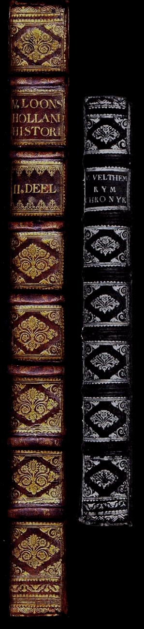
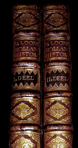
Two huge folio volumes by Gerard Van Loon, Aloude Hollandsche histori : der keyzeren, koningen, hertogen en graaven; : welken, federt de komst der Batavieren inhet thans genaamde Holland - Graavenhaage : Pieter de Hondt, 1734 "There were twenty or more different workshops producing de lux and semi-de lux bindings in the Hague in the eighteenth century. The most important in the first half of the century was without doubt the First Stadholder's Bindery Eerste Stadhouderlijke Binderij, from which one hundred and eighty semi-de lux and de lux bindings have been traced" * It is stated that there are only one hundred and eighty semi-de lux and de lux bindings known; however, this count appears to include examples from the second and third periods, i.e. 1749 to 1793... Dr. Storm's Catalogue lists only 64 as being from 1749 or earlier (and thus probably the work of Johannes Stofvoet, 1687 - 1749). A quick count of the folio pre-1750 catalogued examples shows that nearly half of all books bound are of folio size but only 4 are as large or larger than these volumes, which are 45 cm tall. |
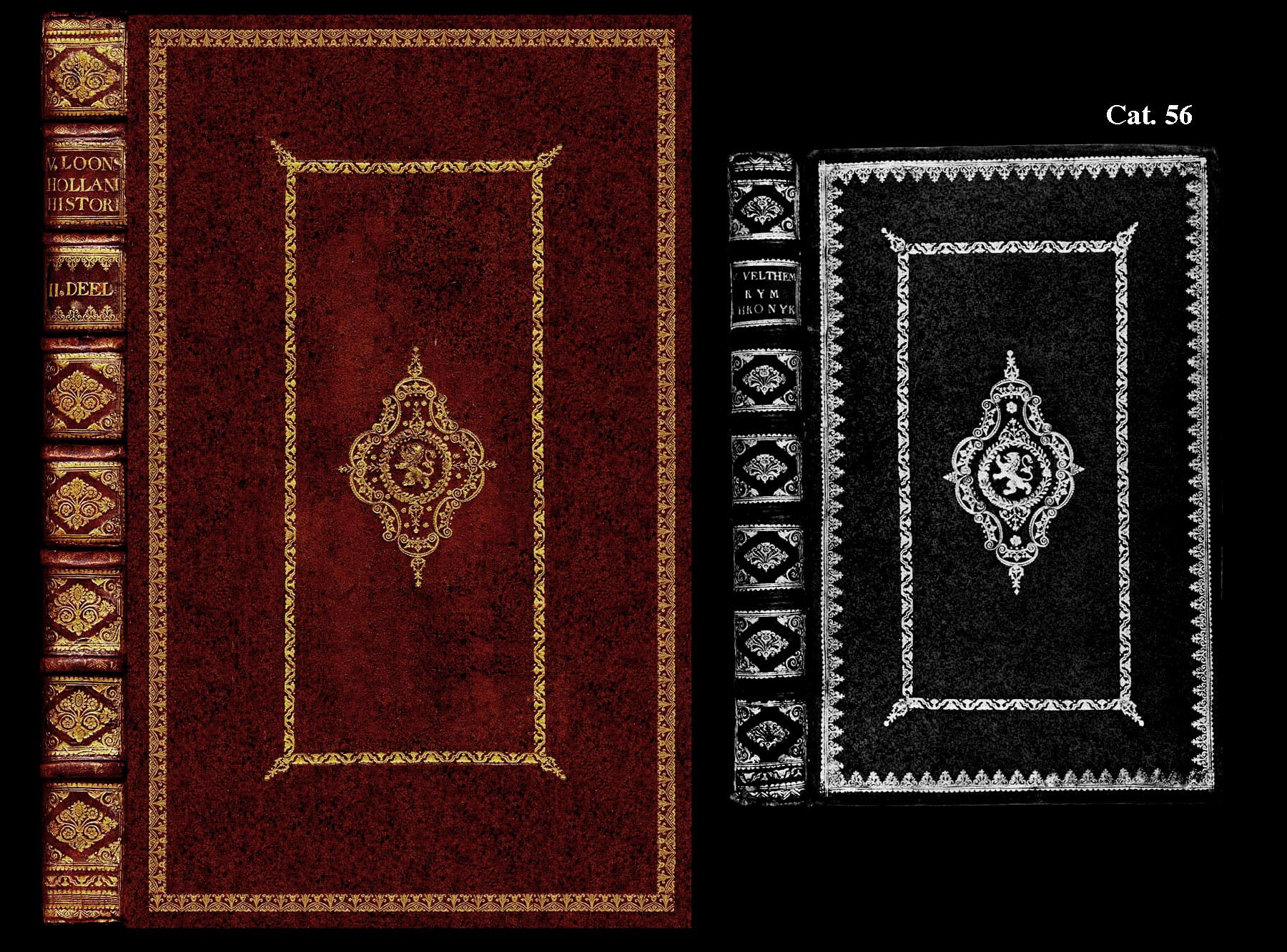
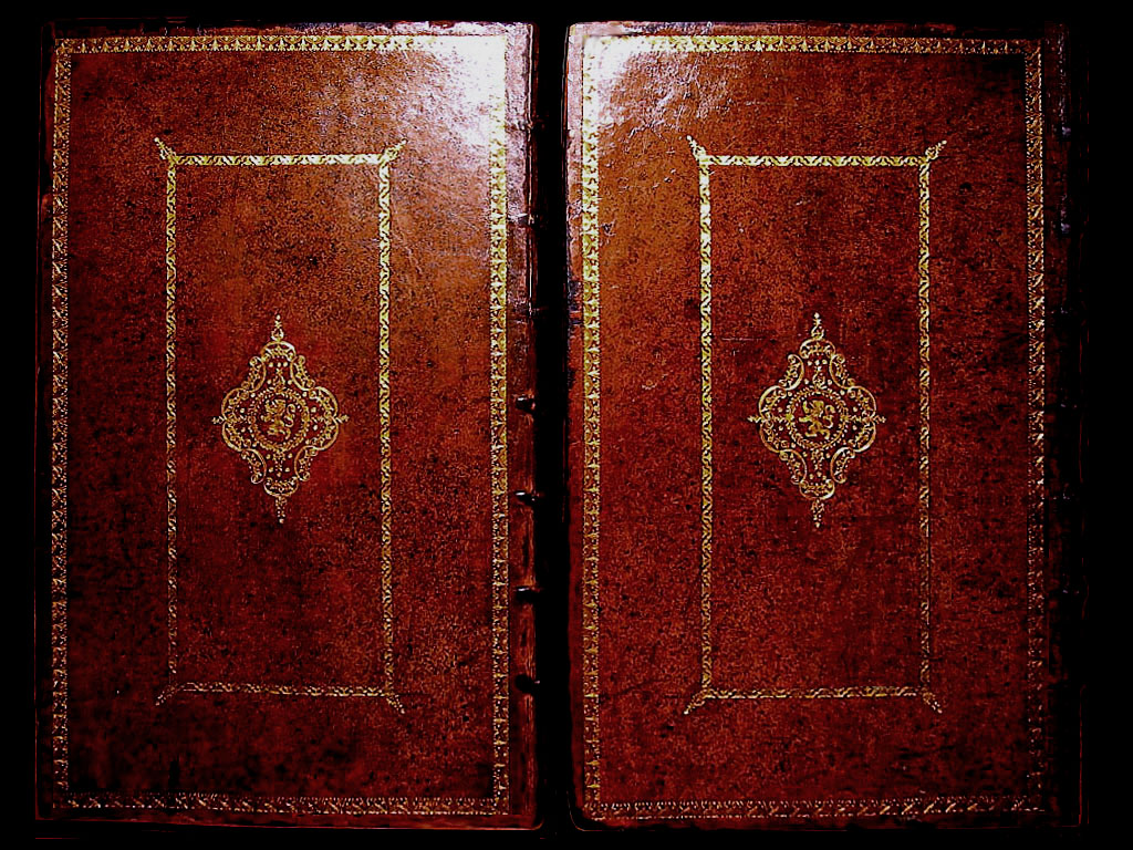
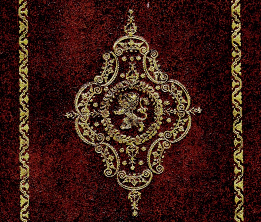
| By a fortunate coincidence Dr. Jan Storm has pictured a very similar First Stadholder's binding in his excellent reference work "De achttiende-eeuwse Haagse boekband in de Koninklijke Bibliotheek en het Rijksmuseum Meermanno-Westreenianum (The Hague, 1976)" (The Hague bookbindings of the eighteenth century in the Royal Library and the Rijksmuseum Meermanno-Westreenianum). Catalogue #56 pictured on Page 435 and described on pages 216 and 217 (shown above). This binding is configured with an almost identical centerpiece arrangement (click on the diagram to see an enlargement) |
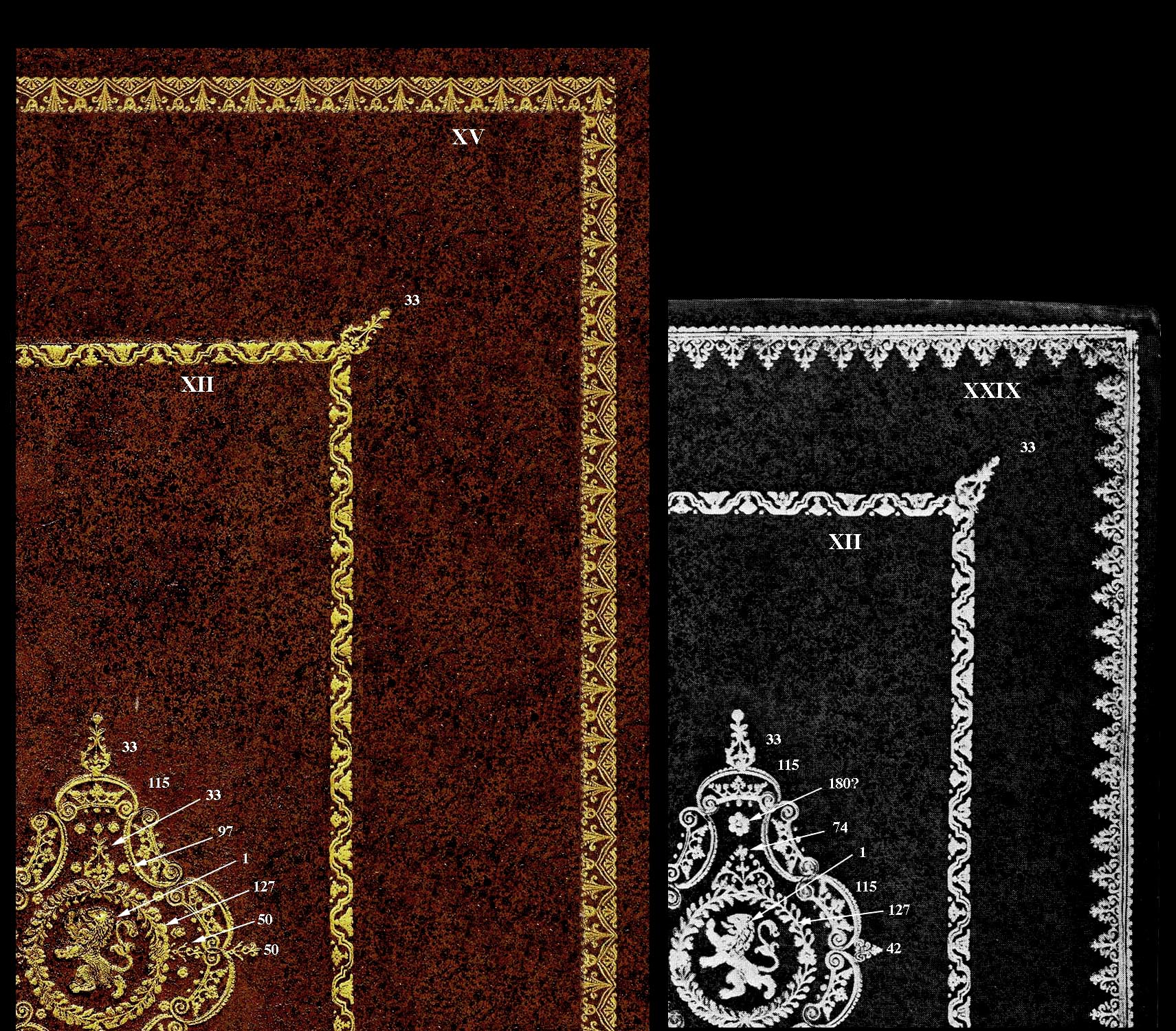
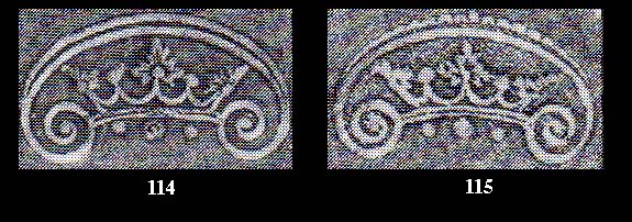
| In the comparative diagram above, I have identified the various tools, using Dr. Storm's classification. We see that both centerpieces share STEMPELS 1, 33, 115, 127, and both are surrounded by the inner framework made with ROL XII and STEMPEL 33 placed in the corners. Further to this a study of the important STEMPELS 114 and 115 reveals that STEMPEL 115 which is nearly identical in size and form to 114, appears a later creation, and is not listed on any catalogue examples prior to Cat. 56. This then strongly suggests that these two very similar bindings are probably from the same period, i.e. 1743 - 1744. |
|
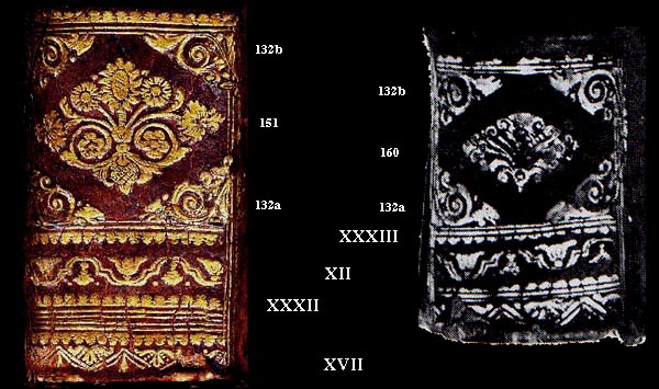
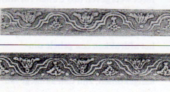
Further parallels can be observed in the decoration of the spines of these two works. Starting at the base with ROL XVII, ROL XXXII and ROL XII which have been employed to decorate the space below the first panel. The low resolution of the Catalogue image and the limited detail of the rubbings, make it very difficult to identify with certainty these ROLs. For example ROL XXXII and ROL XXXIII.... |
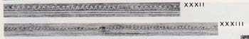
| ...shown above at the actual size as per Dr. Storm's catalogue. This needs to be enlarged and enhanced with a scanner and photoshop.... |
|
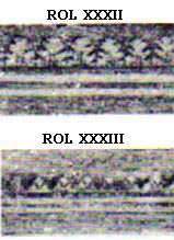
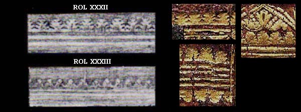
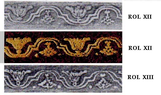
A close inspection of the 300 dpi enlargement shows clearly the differences as well as the fact that ROL XXXII is proportionally larger. A comparison of 300 dpi scans with the rubbings shows that the imprints on the "Histori" spine match in size and detail ROL XXXII. Let us now consider a much more difficult case of identification, ROL 12 and 13 shown below at their actual size as per Dr. Storm's catalogue.... |
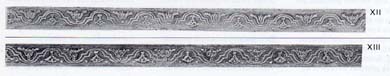
| at first sight these two rubbings look identical however, minute differences become apparent in a 300 dpi scanned enlargement.... |
| here we see the limits of rubbings and even 300 dpi scans. In the comparative diagram below I have selected a detail from a ROL XII imprint found on the "Histori" boards. This detail is one of a very few examples in which the detail is clear enough to allow a possible identification. |
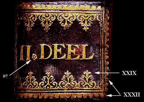
| An obvious difference, apart from the size of these spines is the additional label on the "Histori" spines |