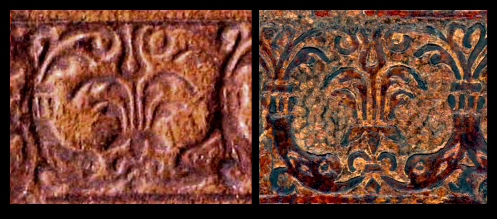
| I found this nearly identical imprint by searching the internet for raffigura una coppia di delfini che si tuffano in una fontana. Google found some research oriented pages at the web site of the Angelo Mai Public Library in Bergamo (Biblioteca Civica Angelo Mai). It was not the first time I have come across their pages which are a mine of information. Unlike many other online Library sites they have gone further in their description of bindings, with enlargements of important details including clasps and individual motifs. This diving dolphin motif is found on a binding that could not have been made before 1522! This was a shock as I was thinking that the IB21254a binding was made much earlier, i.e. 1486. How could these imprints be so similar if they were more than three decades apart? At first site I thought they may even be from the same tool, they were in different states of preservation and lighting and differences in application can cause a lot of differences in the look of an imprint, the hooped curves of the outer hooks liked too much the same to not be the same... I need to compare these two imprints in a way where exact scale was not a factor, in as much as I could not be sure of the exact size of the Angelo Mai example. Ten specimens linked together equalled 147 mm, this gives an approximate size of 1.5 cm, this is close, and anyway if these imprints were the same size but from a different tool we needed to find another way of proving they were or were not different. |
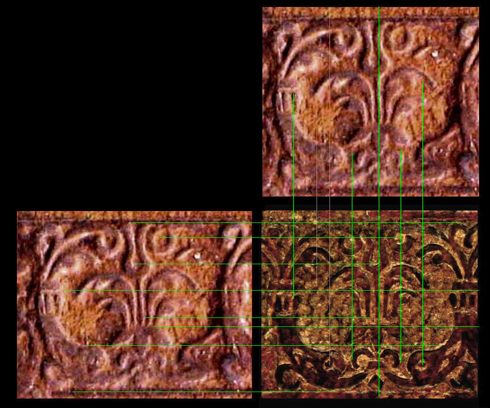
| My green lines test showed up some differences that could not be explained simply by size differences, thus armed with this psychological advantage I proceeded to the next test. Why is physchology important? I you look at two very similar imprints and you are convinced they are the same, they will appear to you as the same, even if they are not. |
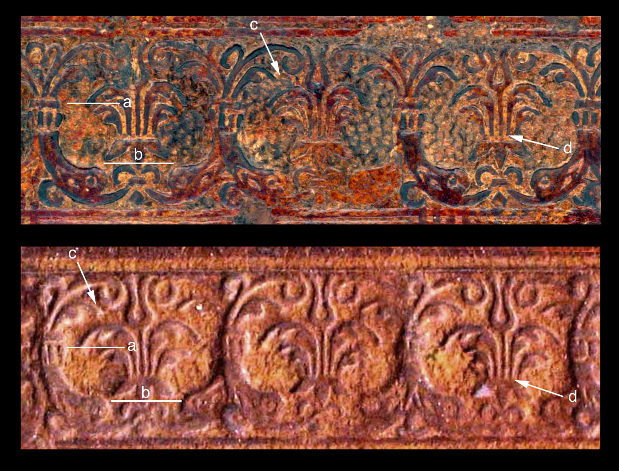
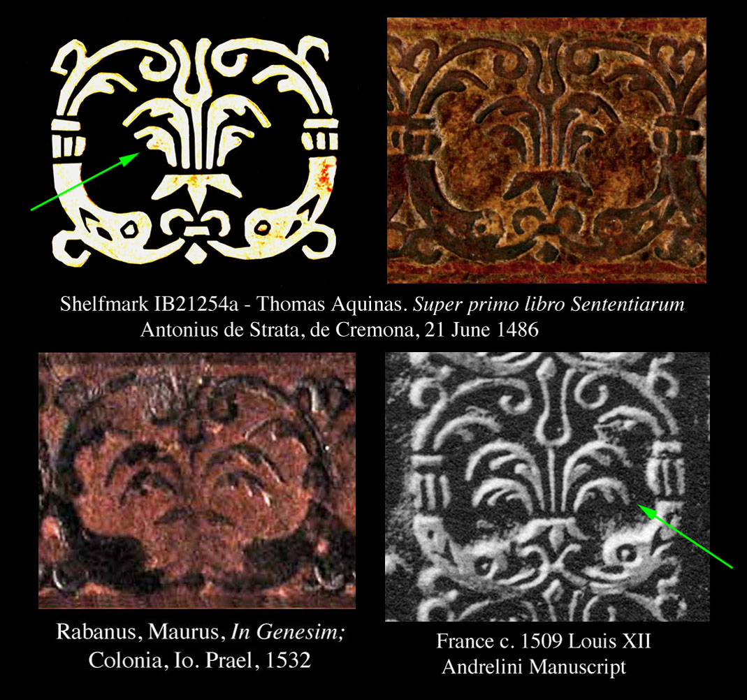
| In Comparative diagram 3, I point out the principal differences in these imprints. By dragging a horizontal line from point 'a' which starts at the top of the lower fountain plume, towards the side of the dolphin we see that in each case the line arrives at a different part of the dolphin. Example 'b' is the most convincing. a line drawn across the top of the lowest plume , in one example it is well above the top of the dolphin heads while the other is not. The arrow from 'c' points to the gap between these details, there is less gap in the Angelo Mai example. Finally the arrow from 'd' is pointing to the gap between the fountain belt and the fountain plumes, there is no such gap in the Angelo Mai examples while it is clearly visible in the IB21254a examples (Thomas Aquinas. Super primo libro Sententiarum Petri Lombardi Venice : by Antonius de Strata, de Cremona, 21 June 1486). |
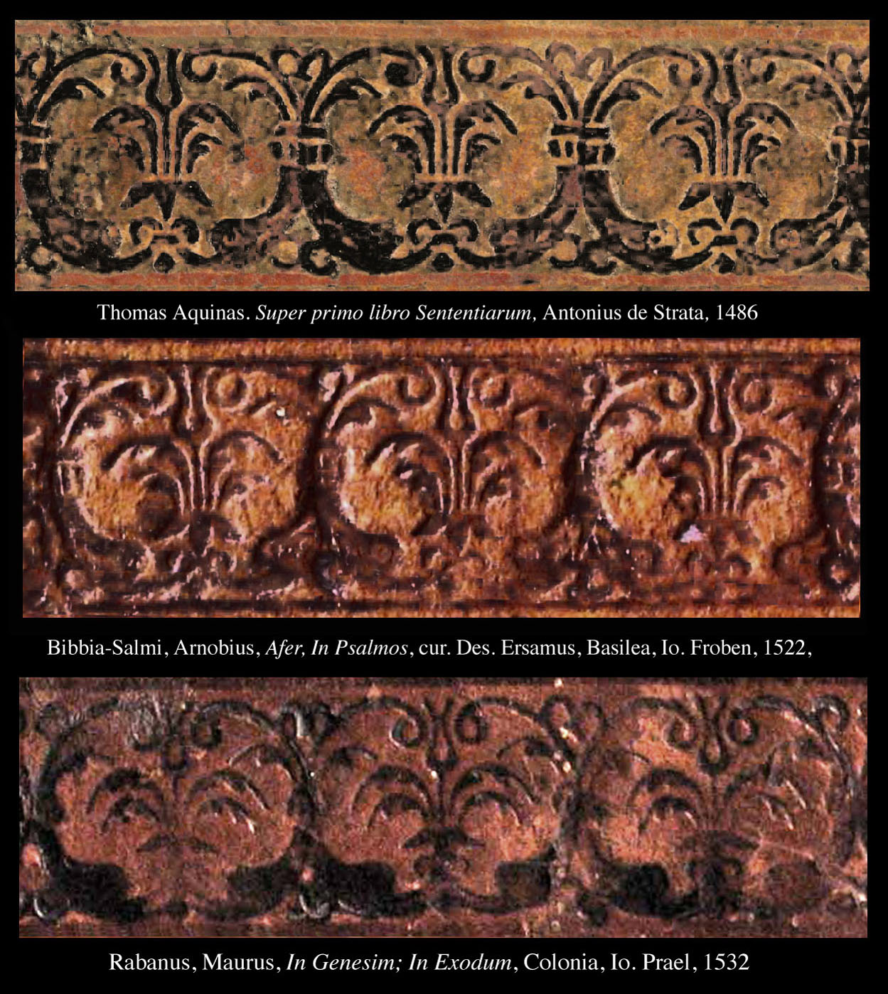
| In Comparative diagram 4, I have altered the color and contrast of the IB21254a examples (Thomas Aquinas. Super primo libro Sententiarum Petri Lombardi Venice : by Antonius de Strata, de Cremona, 21 June 1486) so that the details are more visible, also I have added a third example that also comes from the Angelo Mai collection, this is from 1532, and proof that the diving dolphins motif was a favorite of the Italian bookbinders for many decades. However this Diagram may be misleading as we do not know when the binding shelfmarked IB21254a was made, it may not be contemporaneous with the 1486 printing date. Nor do we know if the binder of the 1522 example was using an old tool from his father's collection. One distinction that I have noticed that may be useful in sorting out these different examples, is the in the so called fountain. It appears to have two layers of spray plumes. I show this in Comparative Diagram 5, below marked with green arrows, Some examples have short plumes with only 2 lobes while others are larger plumes with three lobes. There are of course many other differences such as the dolphins bill or mouth which is sometimes distinctly open. Anthony Hobson (1989 p. 174) claimed that the French Andrelini example was made by a tool imported from Italy and that the imprint was indistinguishable from stamps found in Rome, Venice , and Milan. However once we progress away from the medieval method of using rubbings to identify imprints, a clearer vision of the situation evolves. Modern methods yield a far greater precision. So far in our investigations we have not found any Italian examples that match the Andrelini example, nor have we found any two Italian examples that were identical. Still we will continue to search, on the next page I propose yet another example from the Biblioteca Civica Angelo Mai. |
| about the author | VIRTUAL BOOKBINDING |