|
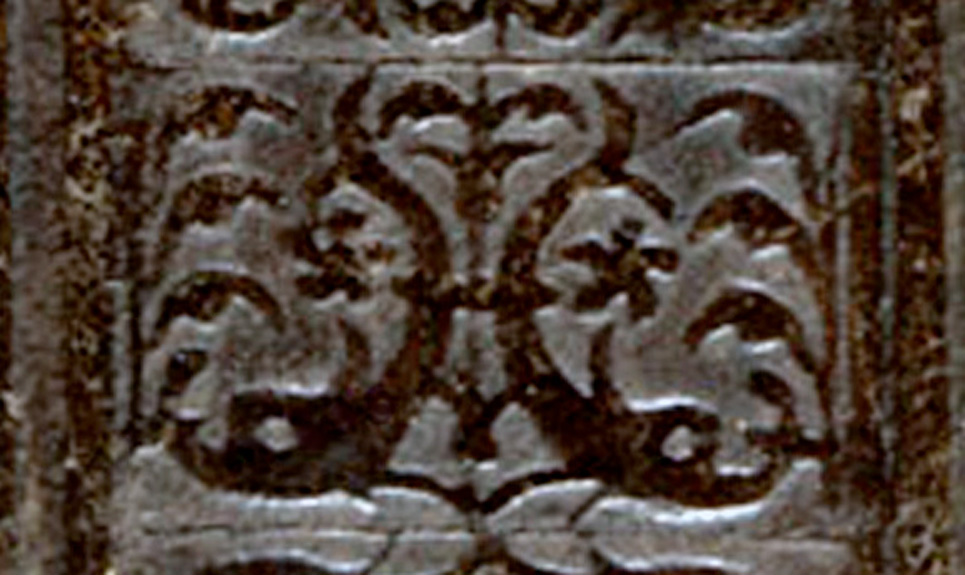
This variant of the diving dolphins comes from an interesting binding found in the digital reproductions from the Braidense website, Fine bookbindings in the Braidense Library. The information for this binding (number 22) states that the binding is presumably Italian, from first half of the 16th century. It covers a manuscript on paper that is from the 16th century (165 x 115 mm.) entitled: Modus visitandi domos sacri Ordinis nostri Carthusiensis; Quaedam necessaria in electionibus priorum nostri Ordinis Carthusiensis The size of binding: 170 x 120 x 28 mm Shelfmark: AD.X.35 Provenance: Certosa di Garegnano (cf inscription a c. Ir) Black morocco over pasteboards with gilt decoration executed with a low carat alloy. Now if you look at the information for this binding given in the Italian text it is a bit more informative but we need to translate it better than google... Moroccan black on cardboard, decorated with gold low alloy . Concentric frames decorated with individual tiles depict : pairs of dolphins diving, repeated in the center opposed as in a mirror image ; pairs of heart-shaped leaves addressed ; pairs of fingers crossed. The Italian origin of this binding is suggested by the pair of dolphins diving into a fountain, from the pairs of heart-shaped leaves and pairs of fingers crossed. Unlike the usual facing dolphins, dolphins represented here face outwards yielding a decoration less uniform , In the center the dolphins are mirrored in alternately opposing tiles, Made in the first half of the XVI century. |
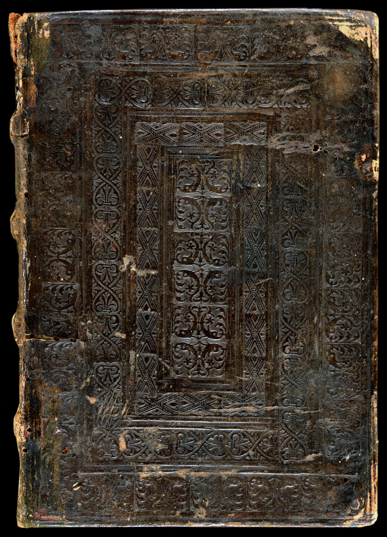
| When you search the internet for examples of anything with the same title as the manuscript in this binding, you find that there are no others, and when you search for Certosa di Garegnano you discover that it is a 14th century Monastery located on the northwestern outskirts of Milan. Perhaps this unique manuscript and binding were made in this Monastery. |

| In Comparative Diagram 1, we see that if you join two of these imprints together they form in the middle something close to the original diving dolphins imprint. Here the dolphins are less abstract, and the imprint is perhaps a more recent form. It is interesting to note that the experts at the Braidense Library suggest that this binding is Italian, based partly on the presence of the diving dolphin imprints. |
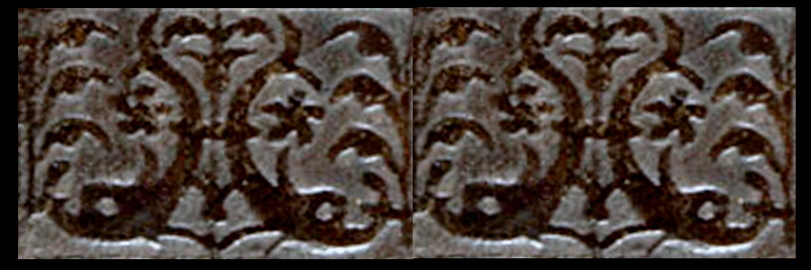
| In chapter 8 of his 1989 book Humanists and Bookbinders, Anthony Hobson, suggested that the diving dolphin imprints found on a French presentation binding of a 1509 Andrelini manuscript for Louis XII, were placed upside down and that they were arranged in a manner that would be unfamiliar to Italians. The motifs were placed one on top of the other instead of the customary side by side fashion. The binding shown above refutes this theory in both regards, the motifs are shown stacked one on top of the other as well as being alternately inverted. This suggests that there were no such rigid constraints on how motifs might be arranged. |
| about the author | VIRTUAL BOOKBINDING |