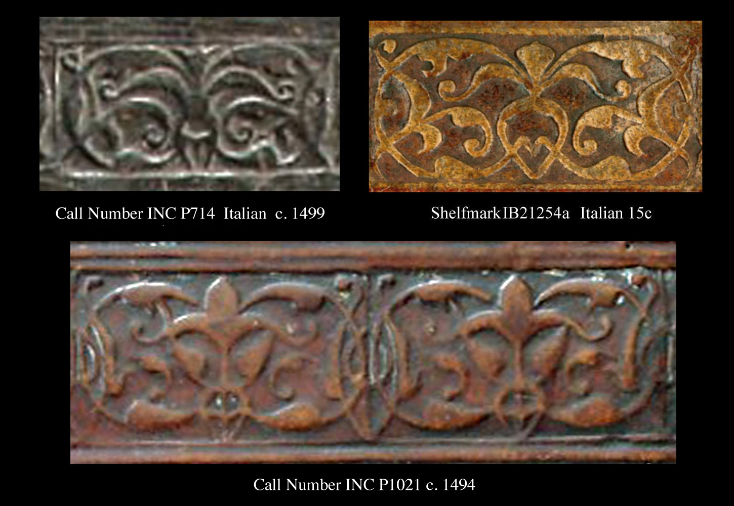
| I know you are probably thinking that you are looking at a part of first century fresco from Nero's Domus Aurea, perhaps found high up on a wall in the Criptoportico, but no, we are in the renaissance some 15 centuries later. These imprints are found on a binding that covers a 1499 Venice printing of Plautinae Viginti comediae emendatissimae, a digital reproduction of this binding can been found in the Folger Shakespeare Library |
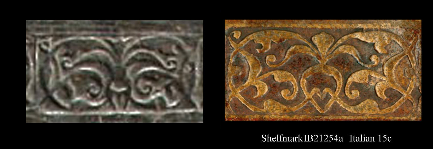
| In Comparative Diagram 1, I show the humanistic imprint from IB21254a shown on the previous page which may be an early form from (c. 1486) verses the INC P714 example which is probably later than c. 1500, still this binder could be using an old tool so it will be very hazardous to try to suggest possible chronological evolutions in the design of this imprint. However we can see that the imprint from binding INC P714 has an even more humanistic shape with an actual body, straighter legs, and looks a bit more devilish with those horns. |
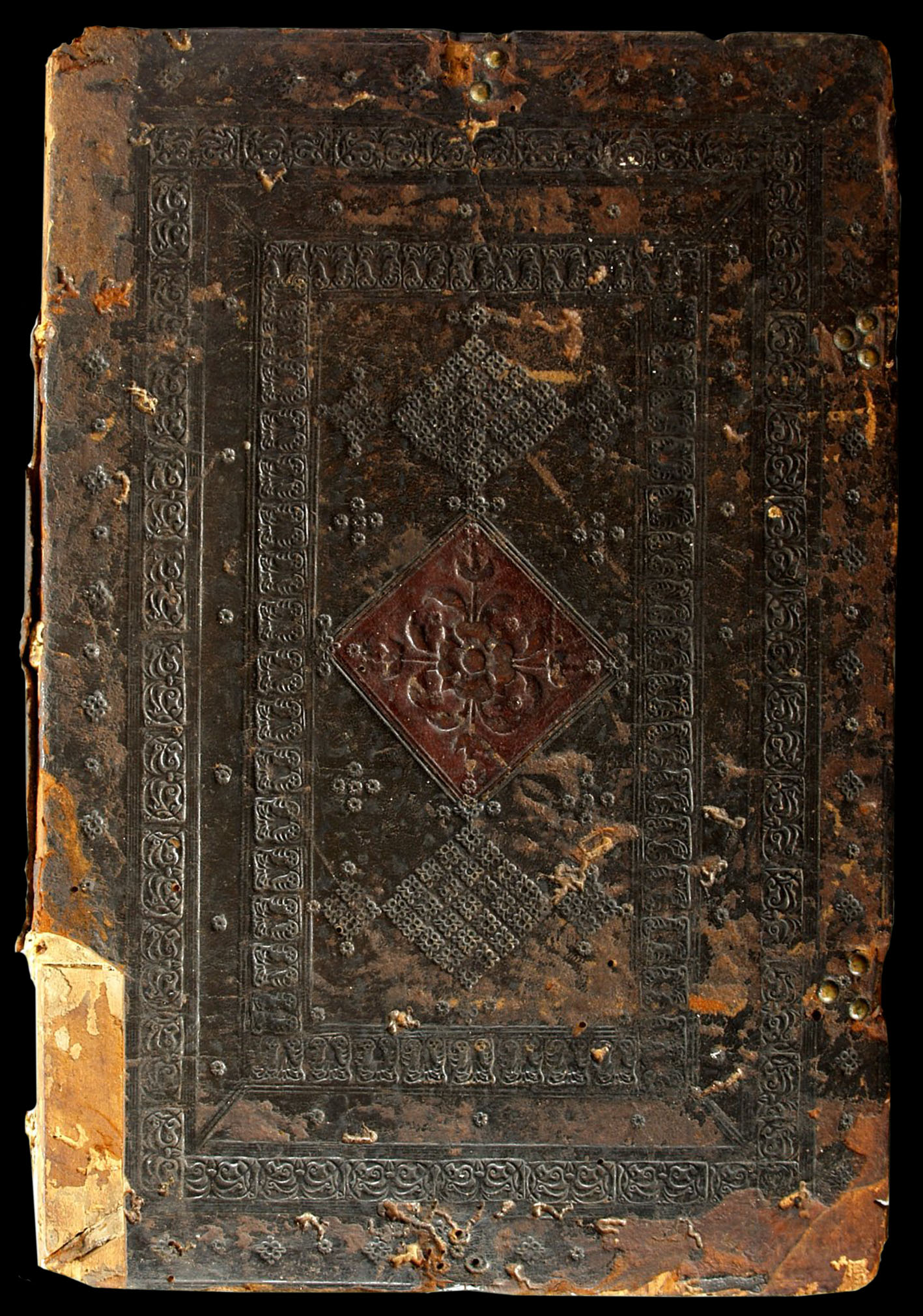
| We could spend hours discussing the elaborate details of this binding, that is far more complex than the IB21254a binding that had only three different decorative stamps, here there are really only five but they have been employed extensively, and the layout reminds me a bit of the plaquette binder style with fleurons dispersed around outside of the outer frame, perhaps the central ornament is not made of separate tools? Here the level of workmanship far exceeds that of IB21254a. |

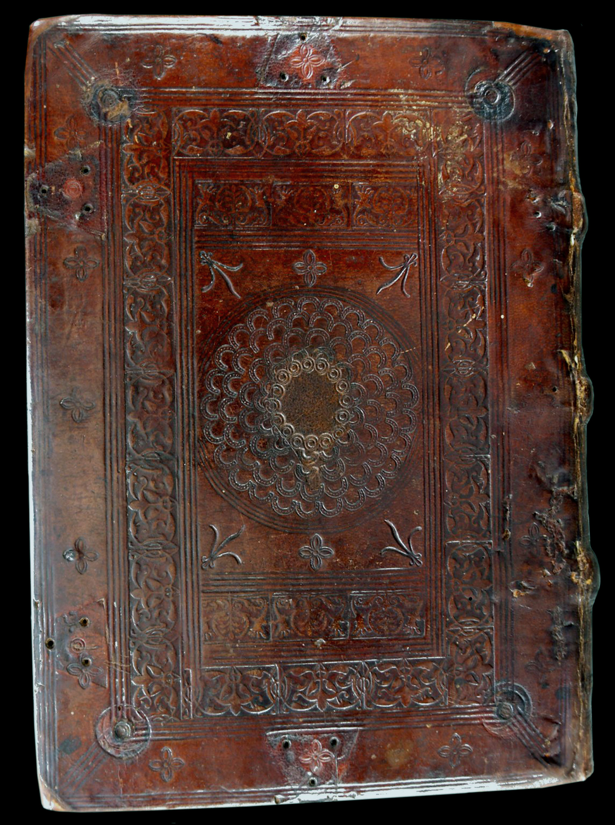
| In Comparative Diagram 2, I show a stylized variant of the humanistic imprint, that comes from the binding shown below INC P1021, this is another stunning example from the digital reproductions of the Folger Shakespeare Library.This binding covers a 1489 (1494?) Venice printing of Morgante Maggiore |
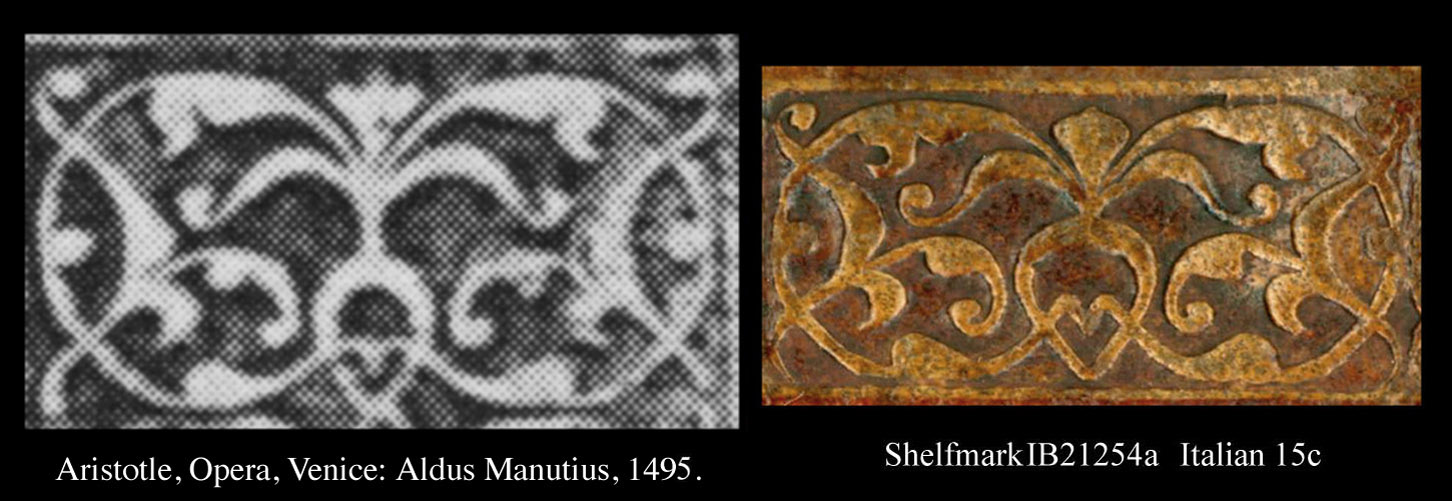
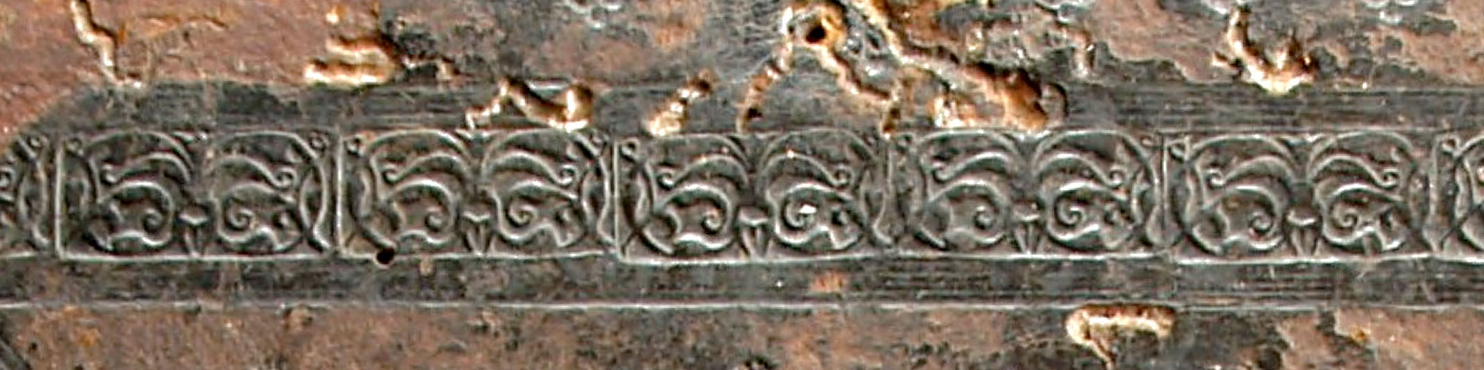
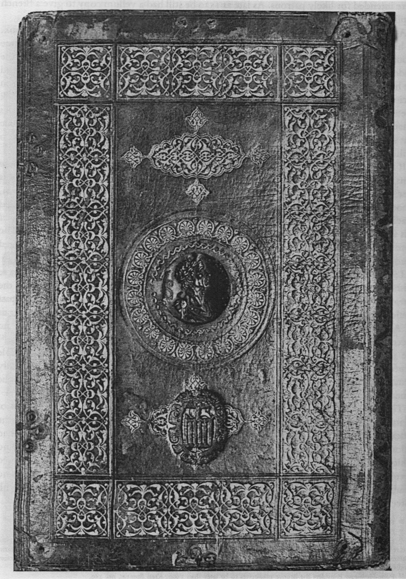
| In Comparative Diagram 4, I have assembled a small collection of the humanistic variants, the black and white Aristotle example which is by far the closest match to our original humanistic imprint. comes from fig. 84 of Anthony Hobson's 1989 book entitled Humanists and Bookbinders. This binding, shown below, is very important for our present study of these imprints. Hobson states that it is the first Venetian example of a plaquette binding that can be exactly dated (1495). He claims that the border tool, meaning I suppose the opposing pairs of humanistic imprints "is copied from lacework" and that "None of the tools on this binding has been identified elsewhere." Thus we have our first reliable indication that tools almost identical to that which produced our humanistic imprint, were in use in Venice at least by 1495. |
| When I first started reading Hobson's book, I was very "off" this word humanist that seems to mean a lot of different things to different people and in different cultural periods. Sort of like the word hippy that can be applied to so many different things. I said to myself I will not join the humanist bandwagon, and then all of a sudden I get this urge to name an imprint humanistic! It must have been some kind of left brain short circuit... |
| about the author | VIRTUAL BOOKBINDING |